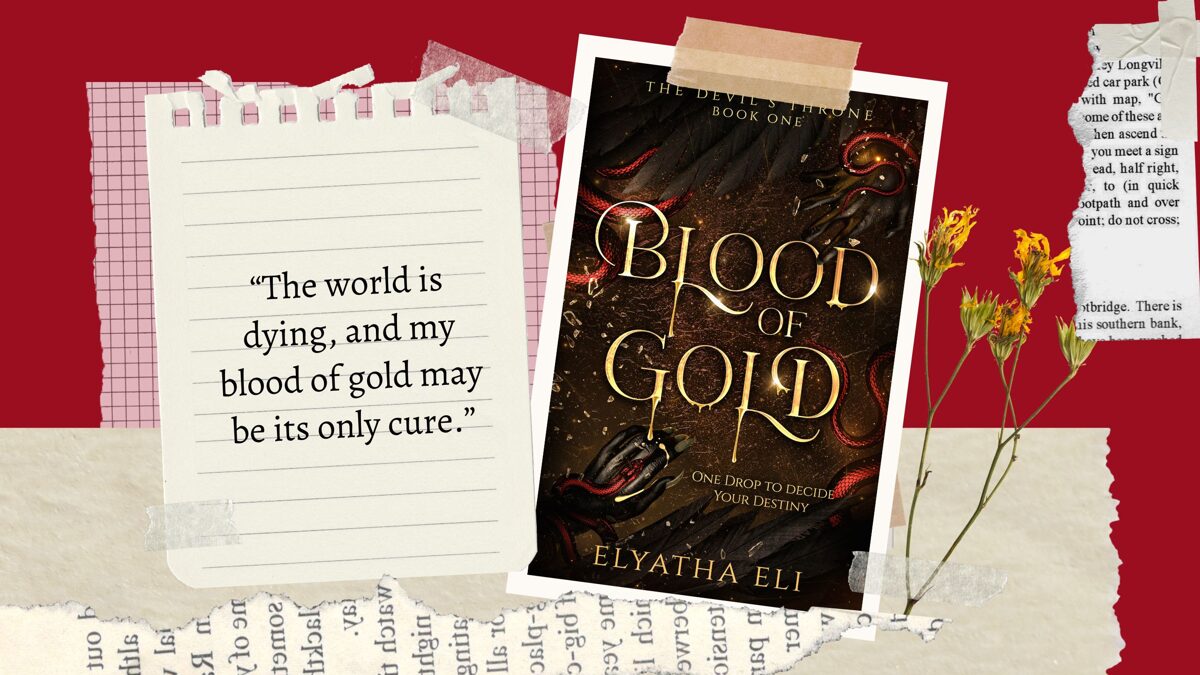
From Concept to Cover: The Artistic Journey of My Cover for Blood of Gold

Have you wondered how other authors choose their covers? Well, here I am to tell you my story.
I started this project over a year ago (I think), and initially, it was supposed to be a standalone novel. All I knew was that I wanted to write a paranormal romance story about a fallen angel and a demon. The first vision I had? It was an alluring yet beastly demon, his fair skin partially covered in dragon-like scales, his wings magnificent, and his claws sharp as he was reaching his bloodied hand toward a bloodthirsty crowd.
This one scene sparked a series of various images before my eyes. I'd see this draconic form everywhere. I don't mean hallucinations, of course (or do I?), but the vivid scene wouldn't leave my mind until I submitted to its creative allure.
Later, the same scene evolved. I'd see a battle arena around the demon and an angel with white yet broken wings. The setting was...well, desolate. Bloody, even.
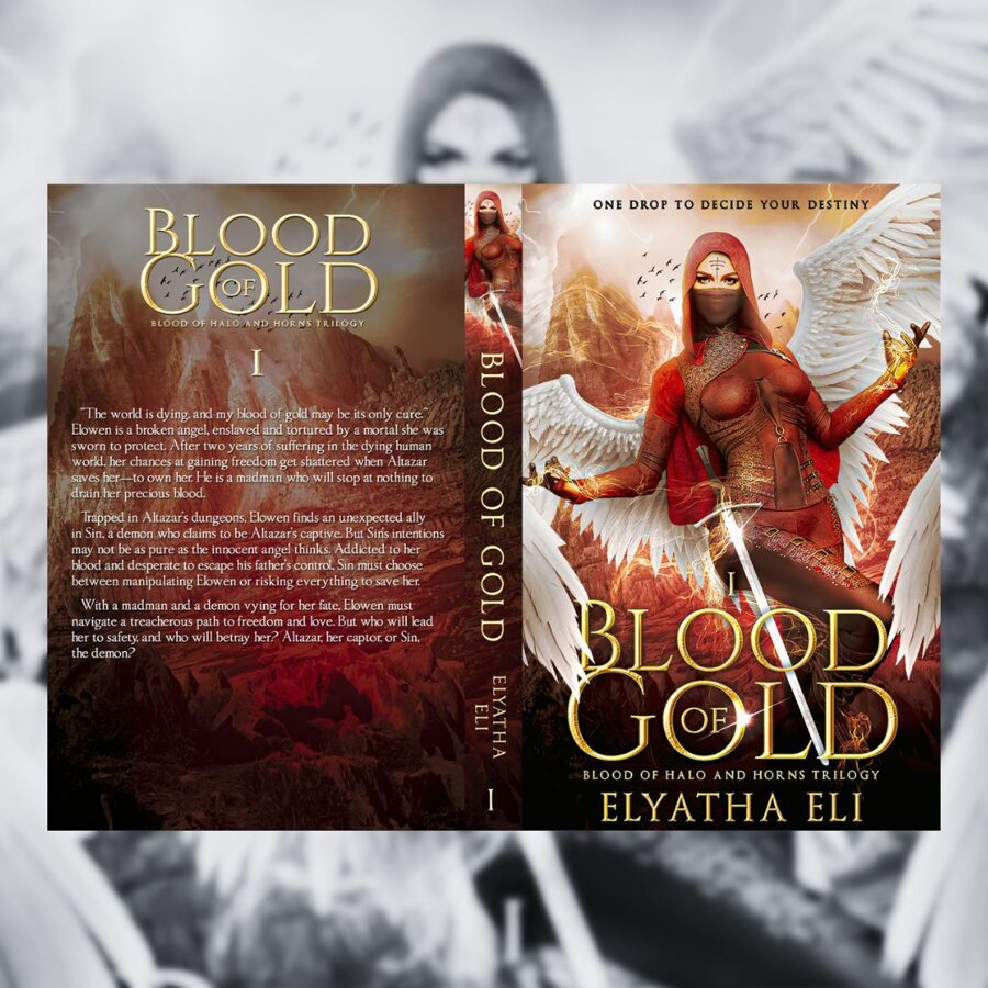
But it wasn't enough for me to write a book about it. So, what did ignite my creative flame? A pre-made book cover! This cover, by RJ Creatives:

As soon as I saw this picture of the mysterious woman, with the wings as dazzling as I'd love to have for myself, I knew this would be the right cover for the story inside me. More vivid scenes evolved in my mind. Aside from the demon in the battle arena, I started seeing a captive angel. A shattering world.
If you have a look at the image above, you can see the orange mountains and the sky that (to me, at least) looks polluted. That's how the setting of my novel came to life. I decided to focus on a futuristic, dystopian world.
But was it enough...? No.
My writing journey was a rocky road. I found myself limiting my creativity to match the concept on the pre-made cover. And that's when I knew I couldn't continue writing the story unless I changed the cover. The next question, though, was what concept should it be?
That's when I reached out to one of my favorite budget services: GetCovers (a Miblgroup brand). They offer stunning custom covers with unlimited revisions, and they're only $10-35 per cover (depending on what exactly you need). I decided I'd try their services because of the affordable cost, hoping they'd give me a clearer image/concept of what I really need.
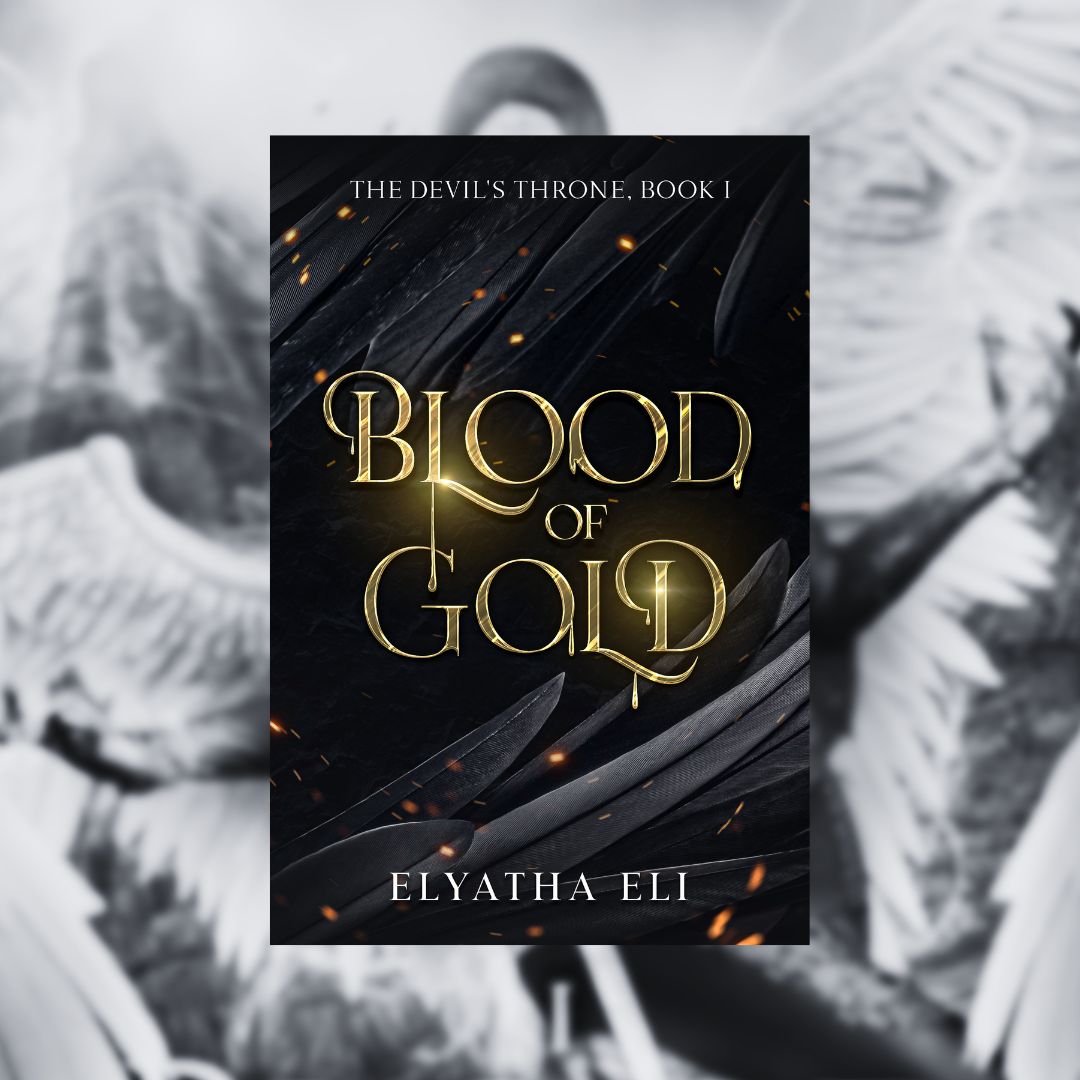
After a series of revisions, this is the stunning cover I got:

It's beautiful.
They captured the idea in a simple yet captivating image, adding just the right magic for the fonts. I absolutely love how the golden letters are dripping.
Still, I had to figure out whether the cover would fit my dark paranormal romance genre and seem appealing to my readers. This led me to my final discovery. I posted an image on my social media, comparing 2 different versions of the cover and asking my followers to vote which one they liked best. The cover by GetCovers was the winner, but...
Something just didn't feel right.
And who am I to say "no" to a new cover designer, right?
Or rather—who am I to stay quiet when I see an artist with so much potential?
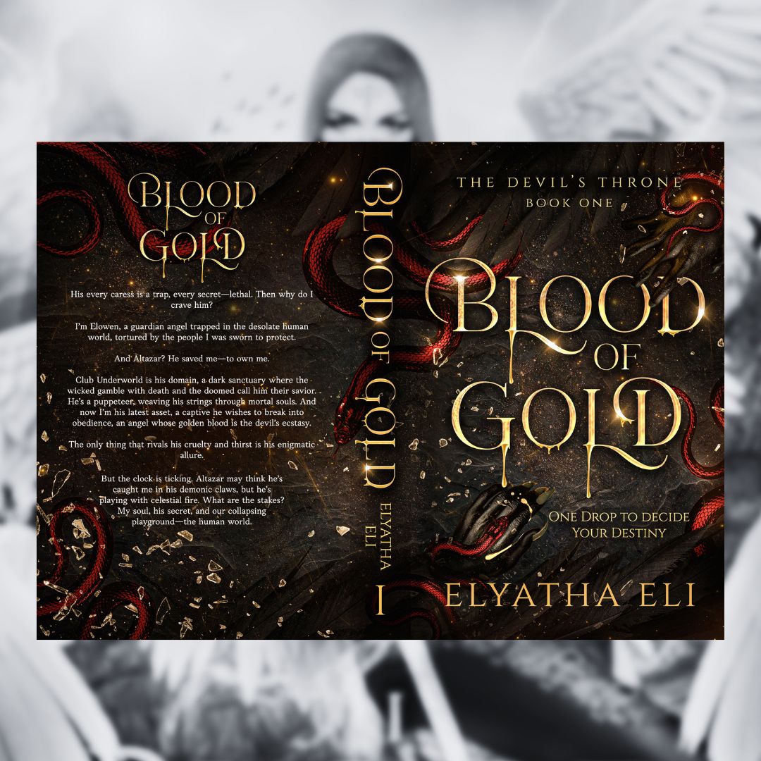
Facebook was my ally when I found my current cover designer, Gigi Creatives. By now, I already knew what exactly I wanted. The fonts dripping golden blood. A demon's hand. Shattered glass. And crimson serpents. When I reach out to my designers, I usually prepare some sort of visual examples and stick them together in a collage, so that's what I did when I reached out to Gigi.
And this... This was the result I got without any revisions. She captured exactly what I wanted. I fell in love immediately.

So, this is my artistic journey to discover the right cover for my book. What do you think? Would you stick to the first cover or keep looking for the one that felt right? Let me know in the comments or reach out on my social media (you can find the relevant icons at the bottom of my website).